In
the debate about climate change/global warming, there is a lingering question –
how can many apparently sensible people question the findings of the IPCC? The Intergovernmental Panel on Climate Change
is one of the shining lights in the UN’s collection of bodies. Does it not
represent the consensus views of many scientists from around the world?
Sadly, it does not. But this leads to the question - how do you determine 'consensus'? It is difficult to go round asking people if they agree - you don't know if they are telling the truth, or they may give you misleading answers. You may slant the question or fudge the answers to get the 'consensus' you desire - which has happened in this sphere recently, as shown by the flaws in the so-called '97% consensus' story.
I think a good way to test consensus is to see what happen if you keep asking the same question. Ask a question, see what the response is; ask it again, and see what the response is; ask it a third time, and then compare the responses. Are there differences over time? If not, then you have true consensus.
This should be one way in which the IPCC finds consensus. The drafts of it's Assessment Reports go through three drafts before being published. Each of those drafts is reviewed by hundreds of reviewers from all over the world. Comments are carefully logged, and summarised by review editors. Changes are made in texts and figures. The end result is supposed to represent the consensus view.
The latest IPCC Assessment Report went through the requisite three rounds of drafting. In September 2013, the report was published in
final draft, “accepted by Working Group I of the IPCC but not approved in
detail.”There was a
key diagram in each of the first three drafts.
It showed how the most recent measurements of the global temperatures
were diverging from predictions made in earlier Assessment Reports.
In the first two rounds of drafting, the figure appeared with other figures comparing predictions to reality. The First Order Draft, Technical Summary, TFE 3 Figure 1, p79 has it thus:-


The black dots represent the different estimates of global temperatures, the various coloured bands represent the predictions, and the grey band is supposed to represent the range of the various predictions.
The AR4 predictions were made in 2007, so by 2012 when the 2011 data was available, everyone was concerned that the measurements were well below the lower range of a prediction made only five years before. There were comments to the effect that this was an important finding, and in the third draft of AR5, the figure was moved up in importance and shown separately as Second
Order Draft, Figure 1.4:-
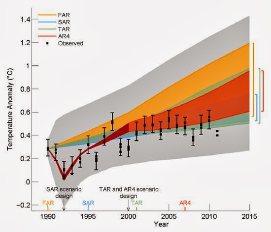
By time of the Third Draft, the full data for 2011 were available, and most of the data for 2012. When shown on this graph, they confirmed that the AR4 predictions were high. So you would think consensus had been achieved. The question as to whether this was a valid representation of the state of the science had been asked repeatedly, and the diagram had been accepted unchanged. I and many other scientists accepted that there was a gap between what we had thought in 2007 would happen, and what by 2013 had actually happened, and were girding our loins to try to find the source of the problem.
Then September 2013 arrived, and with it the final draft:-:

The Final Draft Figure 1.4 was totally different - the scales had changed; the measurements had been slightly shifted, the predictions had been rebased,and the critical data, the comparison between reality and model, had been buried under a mound of spaghetti, being the output of a whole lot of models. Now you could no longer see that there was a difference between model and reality, or that the earlier predictions were high. The simple message of the first three rounds of drafting had been lost. Instead somebody somewhere in the IPCC hierarchy had decided that the simple message was unacceptable, and what the scientists had shown with perfect clarity should instead be buried in a diagram of total incomprehensibility.
Governments everywhere had hoped the IPCC would provide them with sound advice. Slowly the truth is coming out - the IPCC would rather bury a simple message with sleight-of-hand than admit to an obvious shortcoming. Tricky IPICCY indeed!

No comments:
Post a Comment