Showing posts with label consensus. Show all posts

Saturday, February 22, 2014

Consensus? What consensus?

The American Physical Society has just held an extraordinary meeting. It has a Subcommittee looking at climate change. The Subcommittee found it necessary to understand the IPCC consensus on climate science through a workshop which dived deeply into some of the more uncertain aspects. In doing so, it hoped "to illuminate for itself, for the APS membership, and for the broader public both the certainties and the boundaries of current climate science understanding."

People taking part in the workshop included the great climate modeller, Ben Santer of Lawrence Livermore Laboratory; the climatologist Judith Curry from Georgia Tech; the atmospheric physicist Richard Lindzen of MIT; and climate scientist John Christy from the University of Alabama. Each of the specialists would be given a chance to address a set of issues drawn up by the APS panel; the panel would ask questions; there would be a general discussion; and they would move on to the next specialist.

I read the 500-odd pages of transcript.  I think there must be something masochistic in the desire to capture every word, even the announcement that cake was served.  But in amongst the reams of dross, there lay gems.  For instance, Santer produced a lovely graphic showing the problems with his own models:


The top half is what the models say should have happened in the upper atmosphere over the past 34 years; the bottom half is what has actually happened.  The "fingerprint"of the human-derived carbon dioxide is annoyingly absent - well, annoying to the modellers.  The tropical hotspot between about 500 and 700hPa pressure just isn't there.  Yet the physics underlying the carbon-dioxide-driven global warming hypothesis is clear - it should be! Sceptic and believer agree on that. Why is it missing?  And why, for that matter, has the Arctic air warmed ?

Christy confirmed the problem:


The dots give the data; the squares the average of the data; and the spaghetti lines show the attempts of 25 different models to show what might be happening.  Clearly, they fail - the pattern of the fingerprint is wrong. Christy spent some time castigating the IPCC for ignoring this gap between data and models.  The IPCC claimed that the data in the upper troposphere, as shown here, was somehow deficient yet, as you can see, the spread of four independent sets of measurements is quite small and the model average is a long way from the measurement average.

Christy also had some fascinating things to say about the "average global temperature". The estimation of this starts with measuring the temperature at a whole lot of points around the globe.  At each point, the daily maxima and minima are recorded, and the average temperature at that point for that day is the average of the maximum and minimum.  

The trouble comes when you consider what happens in nature, when very often inversions occur and cool air is trapped near the surface.  Then you put a few buildings around the place, and the turbulence they cause destroys the inversion layer and the night air is warmer than it would otherwise be - regardless of any heat coming from the building.  

The net result is that when you look at data from areas that have become increasingly urbanised, there is little change over time in the day-time maxima, but the nights steadily warm, and this then gets recorded as "global warming." Again, the IPCC claims to have looked at the "urban heat island" effect, and to have taken it into account, but Christy showed that a significant correction was needed - because of the basic atmospheric physics.

The APS Panel was concerned as to how is was possible that the IPCC could claim greater certainty in the latest Assessment Report AR5 than in the previous AR4.  In particular, the human impact had gone from 90 to 95% 'certain'. Lindzen was sniffy:
Do you still believe there is consensus?


Tuesday, January 21, 2014

Tricky IPICCY


In the debate about climate change/global warming, there is a lingering question – how can many apparently sensible people question the findings of the IPCC?  The Intergovernmental Panel on Climate Change is one of the shining lights in the UN’s collection of bodies. Does it not represent the consensus views of many scientists from around the world?

Sadly, it does not.  But this leads to the question - how do you determine 'consensus'? It is difficult to go round asking people if they agree - you don't know if they are telling the truth, or they may give you misleading answers.  You may slant the question or fudge the answers to get the 'consensus' you desire - which has happened in this sphere recently, as shown by the flaws in the so-called '97% consensus' story.

 I think a good way to test consensus is to see what happen if you keep asking the same question.  Ask a question, see what the response is; ask it again, and see what the response is; ask it a third time, and then compare the responses.  Are there differences over time?  If not, then you have true consensus.

This should be one way in which the IPCC finds consensus.  The drafts of it's Assessment Reports go through three drafts before being published.  Each of those drafts is reviewed by hundreds of reviewers from all over the world.  Comments are carefully logged, and summarised by review editors.  Changes are made in texts and figures. The end result is supposed to represent the consensus view.

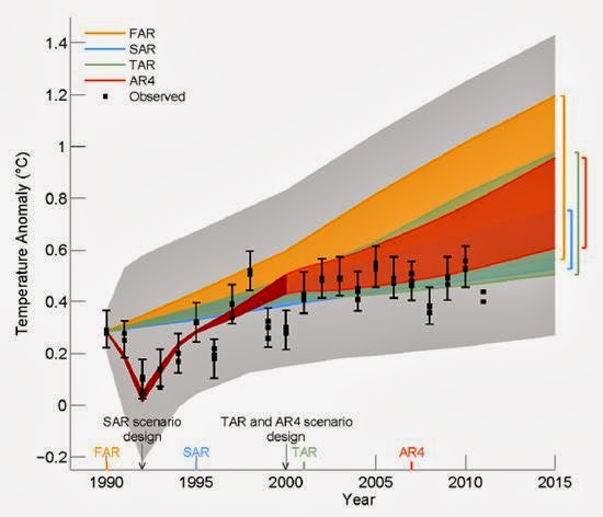
The latest IPCC Assessment Report went through the requisite three rounds of drafting. In September 2013, the report was published in final draft, “accepted by Working Group I of the IPCC but not approved in detail.”There was a key diagram in each of the first three drafts.  It showed how the most recent measurements of the global temperatures were diverging from predictions made in earlier Assessment Reports. 

In the first two rounds of drafting, the figure appeared with other figures comparing predictions to reality.  The First Order Draft, Technical Summary, TFE 3 Figure 1, p79 has it thus:-

The black dots represent the different estimates of global temperatures, the various coloured bands represent the predictions, and the grey band is supposed to represent the range of the various predictions.

The AR4 predictions were made in 2007, so by 2012 when the 2011 data was available, everyone was concerned that the measurements were well below the lower range of a prediction made only five years before. There were comments to the effect that this was an important finding, and in the third draft of AR5, the figure was moved up in importance and shown separately as Second Order Draft, Figure 1.4:-


 By time of the Third Draft, the full data for 2011 were available, and most of the data for 2012. When shown on this graph, they confirmed that the AR4 predictions were high.  So you would think consensus had been achieved.  The question as to whether this was a valid representation of the state of the science had been asked repeatedly, and the diagram had been accepted unchanged.  I and many other scientists accepted that there was a gap between what we had thought in 2007 would happen, and what by 2013 had actually happened, and were girding our loins to try to find the source of the problem.


Then September 2013 arrived, and with it the final draft:-:

The Final Draft Figure 1.4 was totally different - the scales had changed; the measurements had been slightly shifted, the predictions had been rebased,and the critical data, the comparison between reality and model, had been buried under a mound of spaghetti, being the output of a whole lot of models.  Now you could no longer see that there was a difference between model and reality, or that the earlier predictions were high. The simple message of the first three rounds of drafting had been lost. Instead somebody somewhere in the IPCC hierarchy had decided that the simple message was unacceptable, and what the scientists had shown with perfect clarity should instead be buried in a diagram of total incomprehensibility.

Governments everywhere had hoped the IPCC would provide them with sound advice. Slowly the truth is coming out - the IPCC would rather bury a simple message with sleight-of-hand than admit to an obvious shortcoming.  Tricky IPICCY indeed!